The News In Numbers (The NIN)
The NIN (en-eye-en) is a data-first news outlet stripping away partisan noise to deliver global headlines through clinical, objective numbers. The brand personality is “Institutional Tech”—authoritative, precise, and sophisticated—blending the reliability of a legacy firm with a modern, digital-first edge.
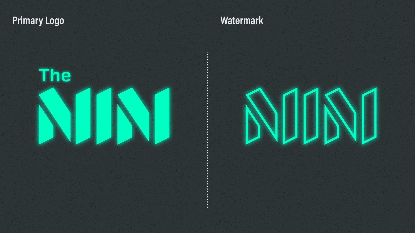
Primary Logo & Secondary Watermark
The glow effect and sharp angles reflect the “Neon-Surgical” vibe of high-end data interfaces. The watermark drops the article, leaving only the monogram, and hollows the glyphs for use as a compact, inobtrusive signature on brand materials.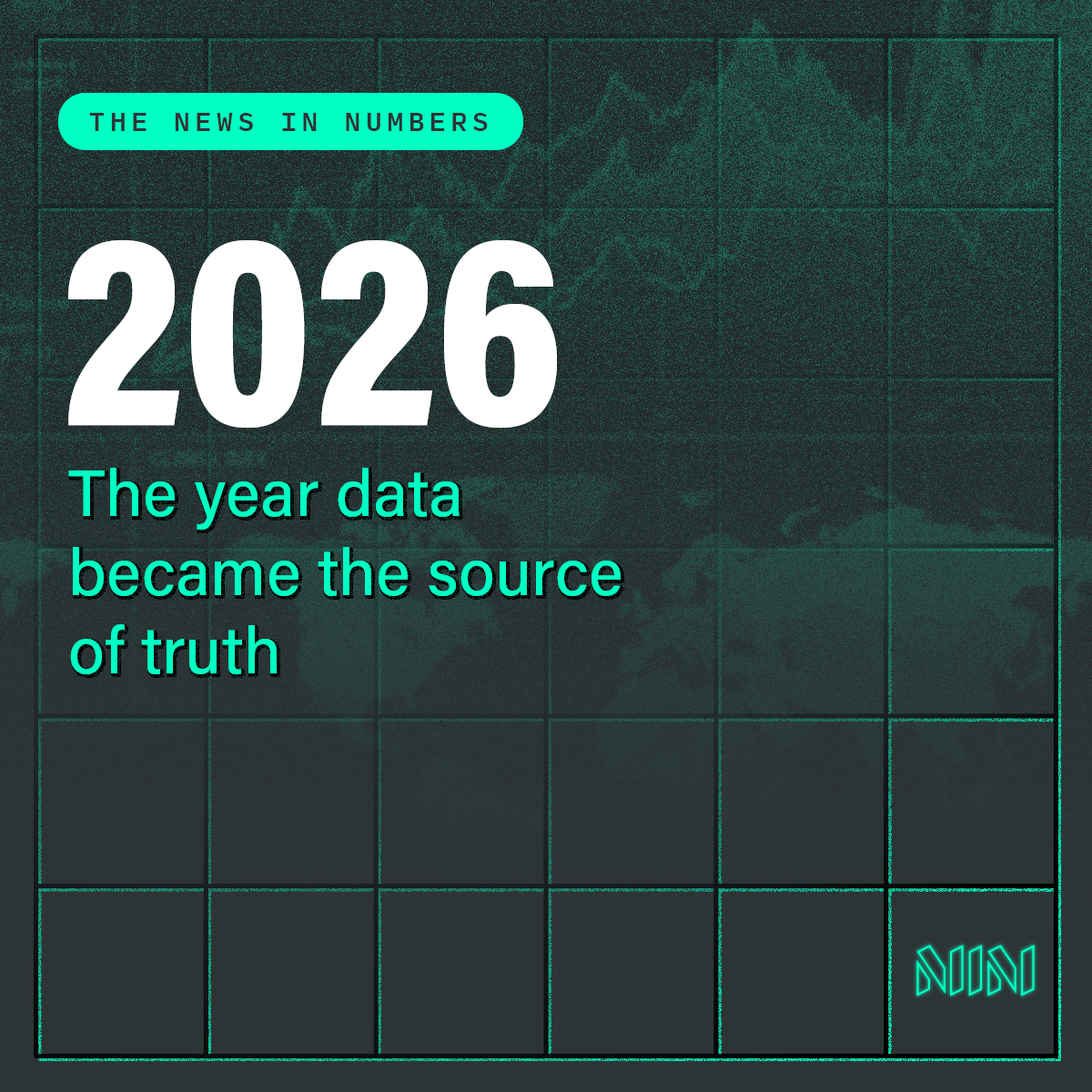
ID Card for Brand Launch
The brand ID card is pinned on The NIN’s social media pages as a “Statement of Intent,” an encapsulation of the news outlet’s mission to be a definitive Source of Truth in a complex era. It is not just the text but the structure and texture of the design which establish the brand’s “Institutional Tech” personality. The impactful “2026” hero text serves as the “Big Number” headline, which is the anchor point of The NIN’s storytelling architecture. The faint technical grid which defines the composition represents objectivity and structure, while the grainy, low-contrast brackground graphic adds texture which prevents the brand from feeling too sterile.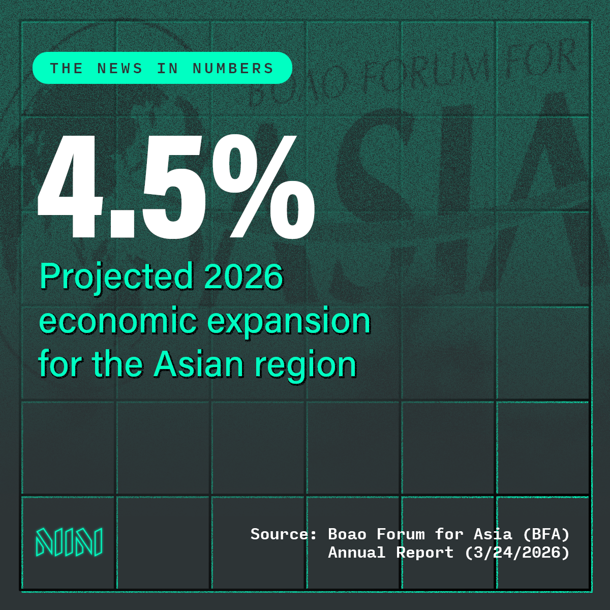
News Card Sample 1
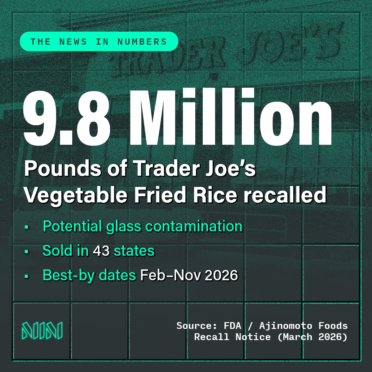
News Card Sample 2
Social Media Profile Banner
This secondary graphic supports the brand personality established by the logo. A “command center” aesthetic signals technical proficiency and competent analysis to anyone visiting the profile.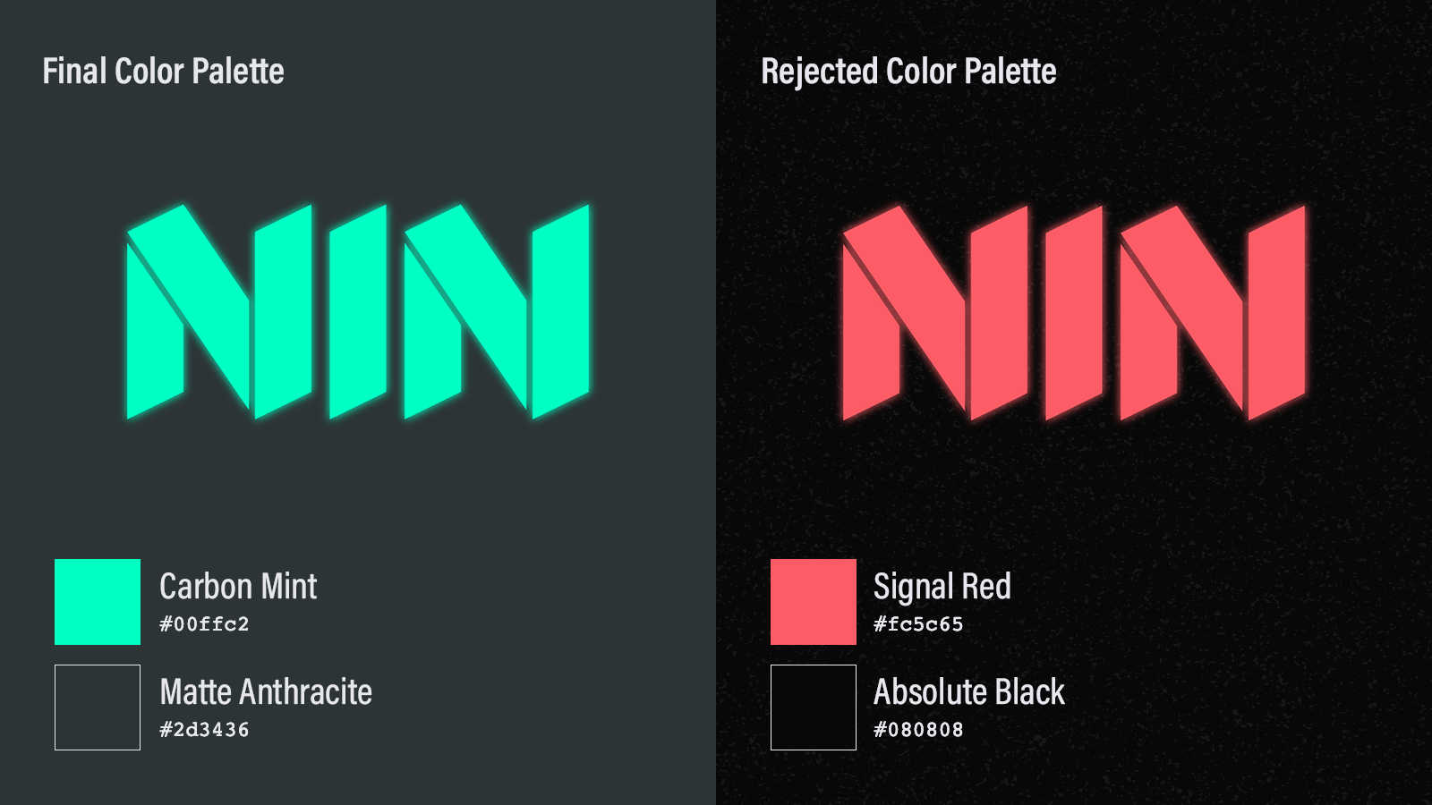
Color Palettes – Final vs Rejected
The final color palette is fresh and contemporary and feels energetic without being frantic, signaling precision and modern authority. Carbon Mint is the brand’s “Data Pulse.” Unlike traditional “Money Green” (which feels like a 20th-century bank) or “Signal Red” (which feels like an emergency), Carbon Mint is high-tech, high-visibility. It is the “light” of truth cutting through the “darkness” of misinformation. Matte Anthracite serves as the “Foundation” of the brand. This architectural, heavy grey offers more depth than pure black, recalling carbon fiber, high-end electronics, and brutalist concrete. It lends gravity to the brand voice. Together, the two brand colors create an effect reminiscent of a Bloomberg Terminal or an augmented reality heads-up display (HUD). The final color palette feels Dark Mode native, premium, and calm under pressure.The rejected Signal Red and Absolute Black combination felt too alarmist. Red triggers a biological stress response associated with “Breaking News” clickbait. The NIN aims to be the opposite of sensationalist, so the cooler, more calculated Carbon Mint was chosen to represent objective clarity.
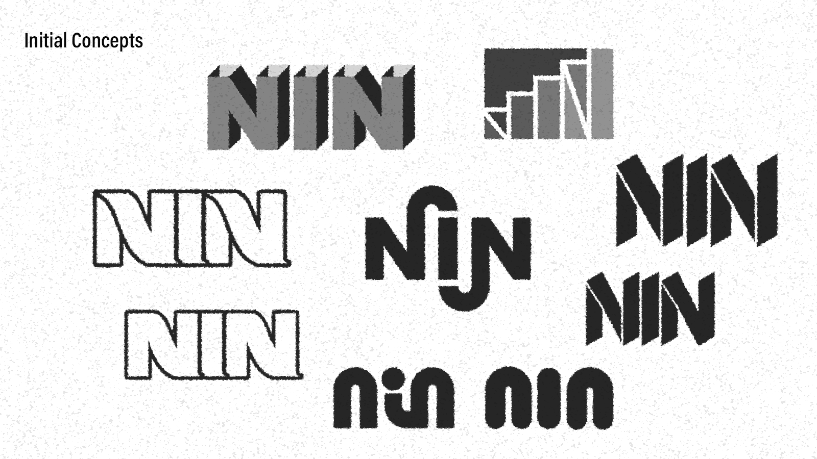
Logo Concept Exploration
Many early sketches used rounded, friendly typography or literal bar-chart icons. These felt too “soft” or “generic startup.” The brand required a more aggressive, monospaced, and geometric feel to command institutional respect.Godoy Law Center
Logo and basic brand palette. Design process included competitive research and methodical development of logo options by permutation of fixed variables (i.e., font, color, graphical symbolism).
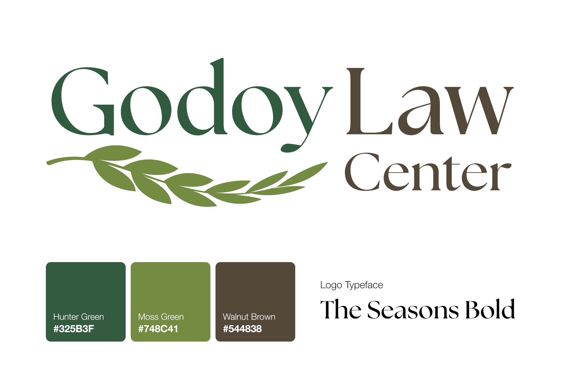
Brand Palette
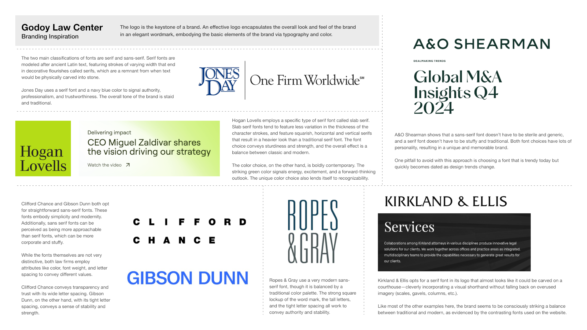
Competitive Research
The first step in the logo and brand design process was competitive research, surveying and analyzing the logos of a variety of different law firms. We studied how each logo’s different elements work together to create a specific brand personality and voice–embodying, variously, such values as authoritativeness, strength, trustworthiness, openness, tradition, progressiveness, etc. This exercise gave the client a jumping-off point for thinking about their own brand “vibe.”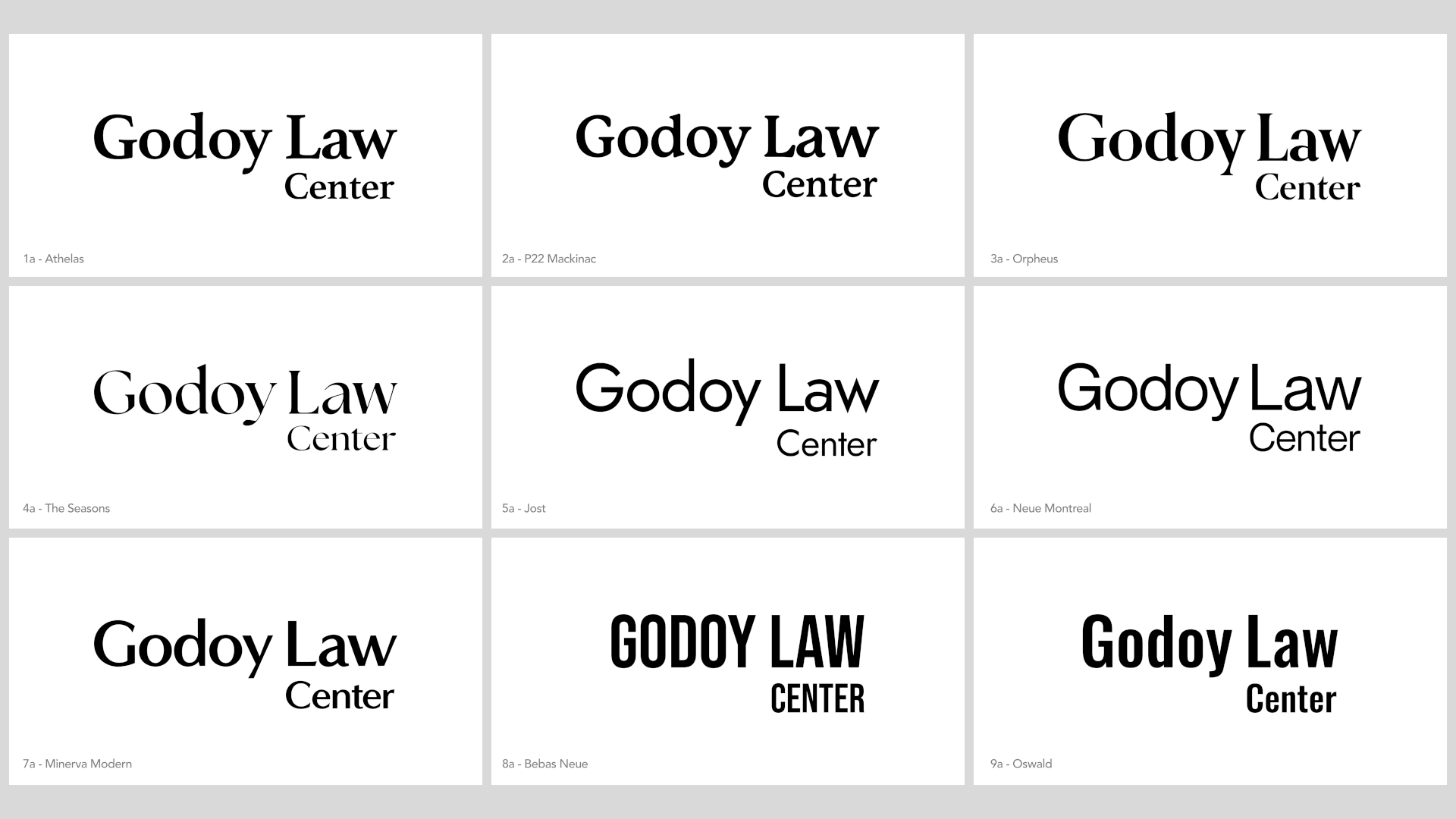
Preliminary Logo Concept Exploration
In the first batches of logo concepts, we excluded color and graphical symbols to focus on different font options and begin zeroing in on the appropriate style for the brand, keeping in mind the findings of our competitive research.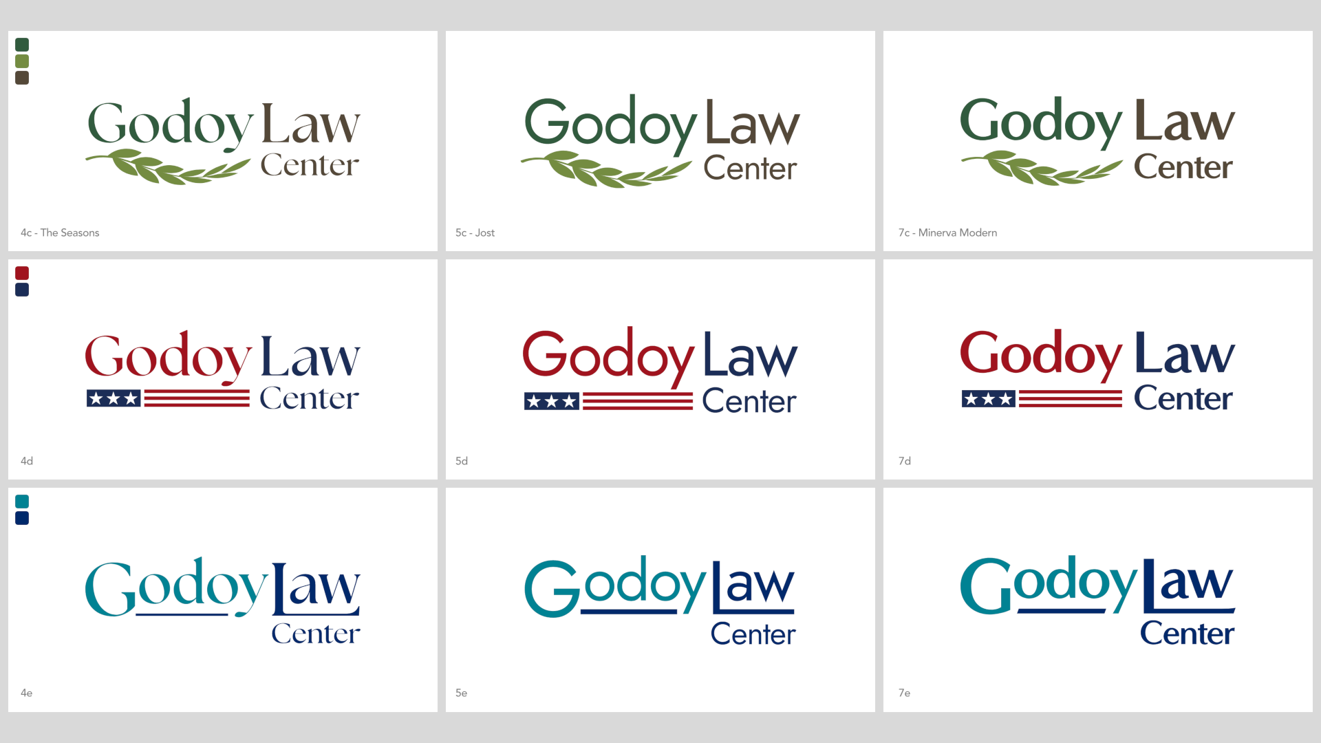
Final Logo Candidates
After narrowing down the typeface, color palette, and graphical flourish options to three each, we synthesized them in different permutations to create a set of distinct but equally viable logos. We worked with the client to clarify their desired brand voice and select a final logo accordingly.EdgePay
Name, logo and style guide for an online payment processor.
Brand Palette
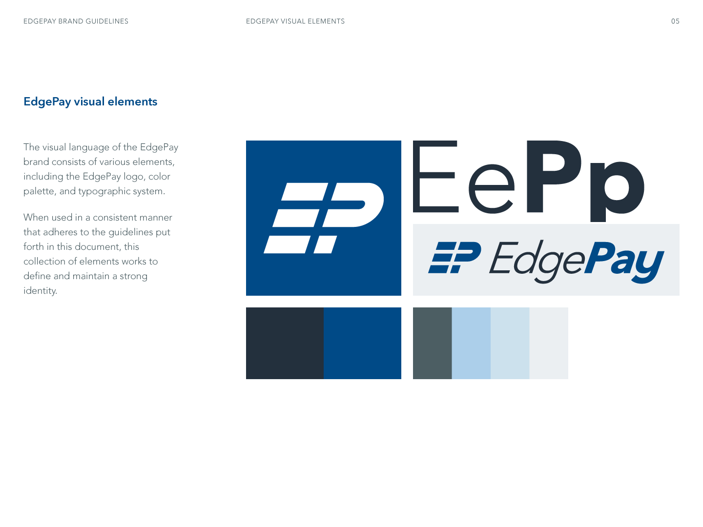
Introduction to Brand Guide
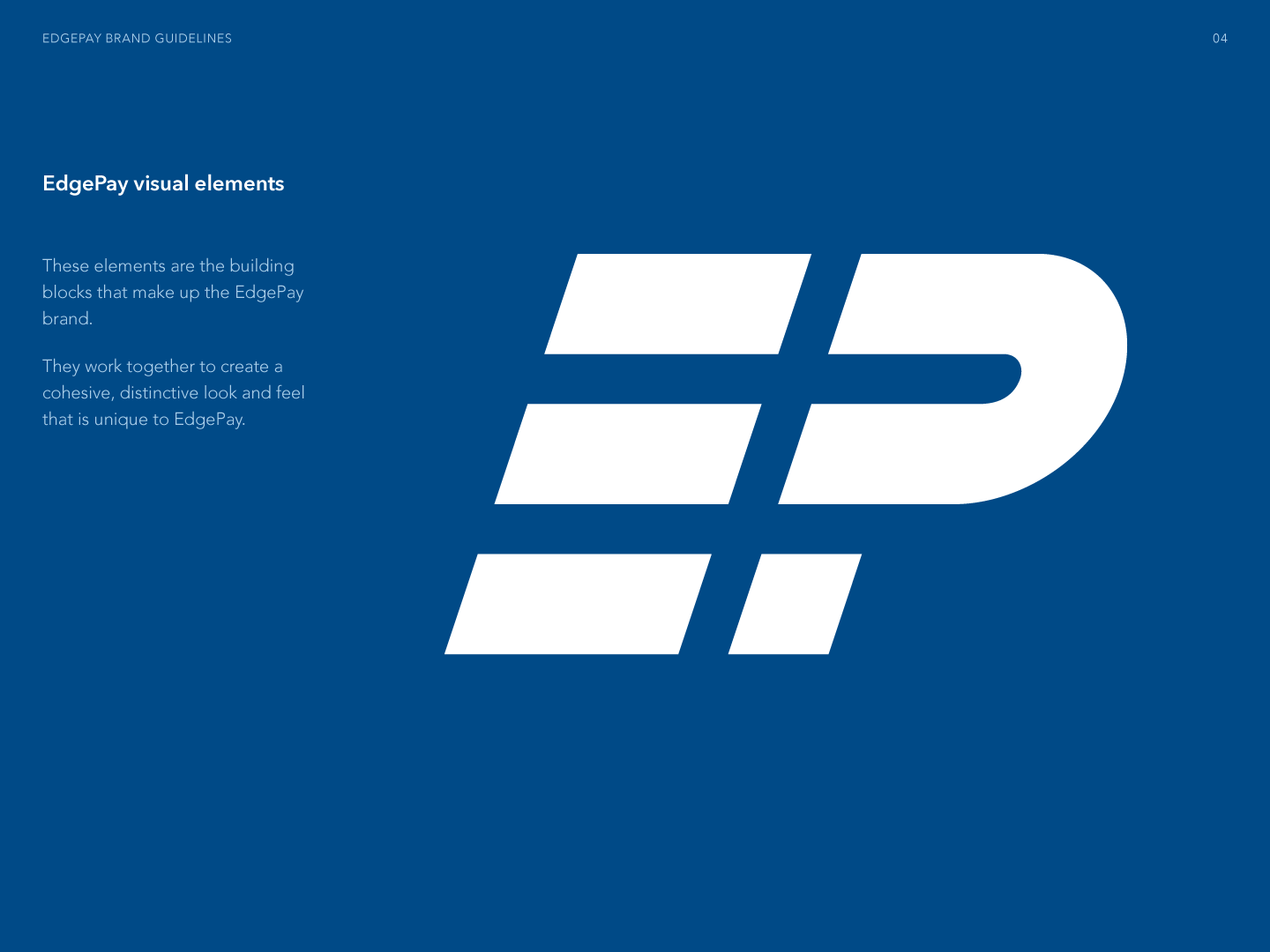
Basis of Visual Language
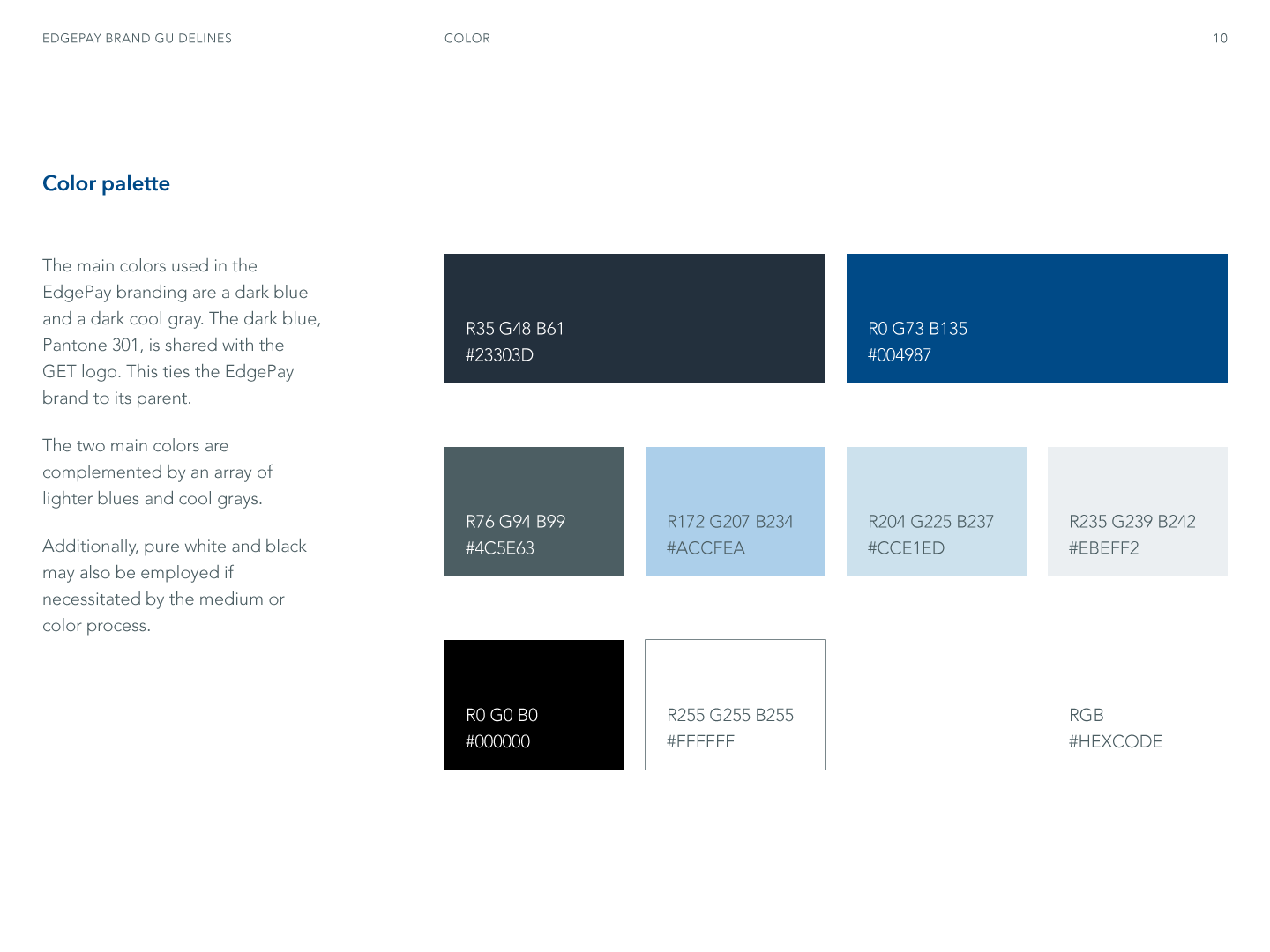
Color Palette
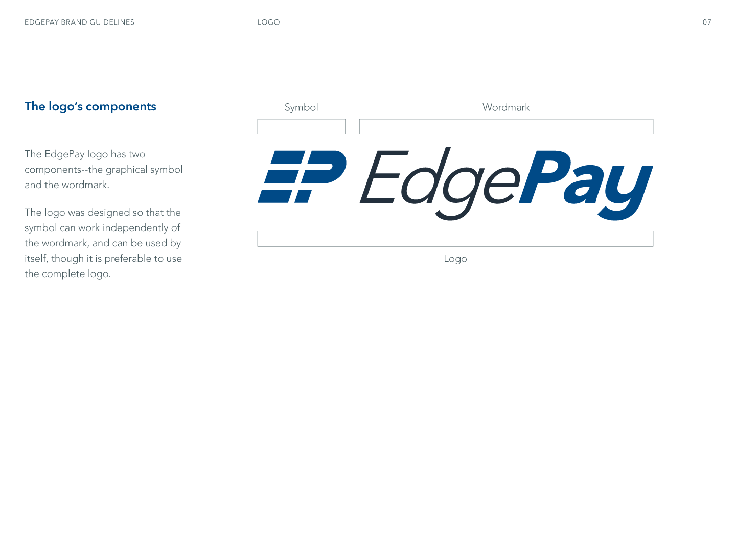
Logo Components
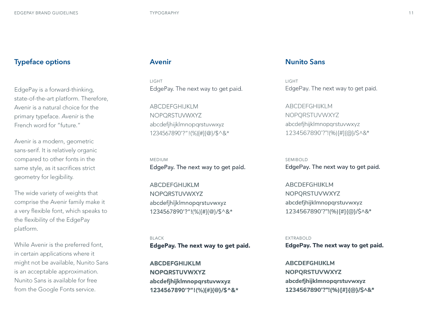
Typography
HonestRx
Logo and style guide for a new online pharmacy.
Logo
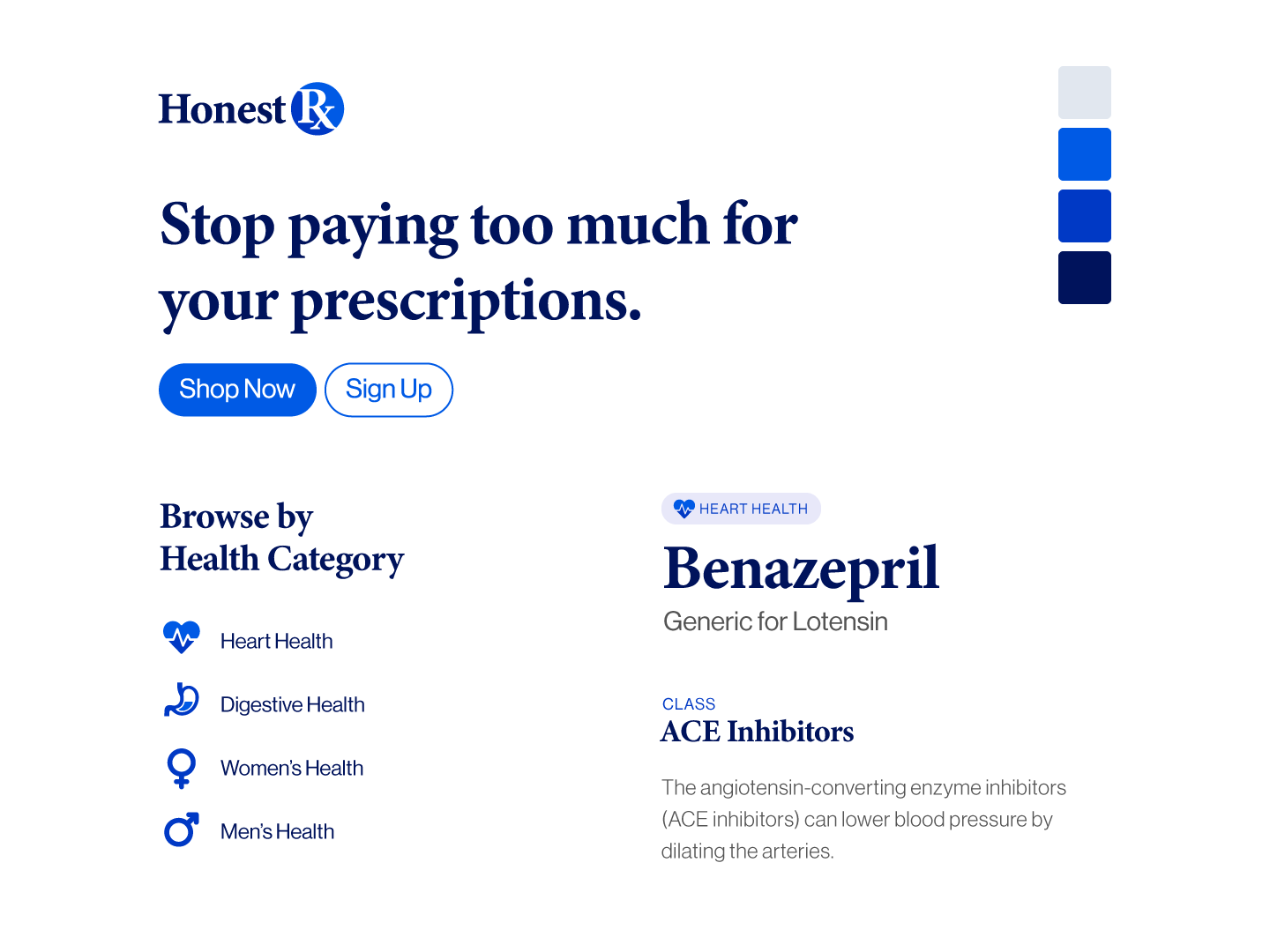
Style Tile
Logo, Colors, Typography, Buttons, and IconsAccess Control Products
Logo, style guide, and business card design for access control product eCommerce site.
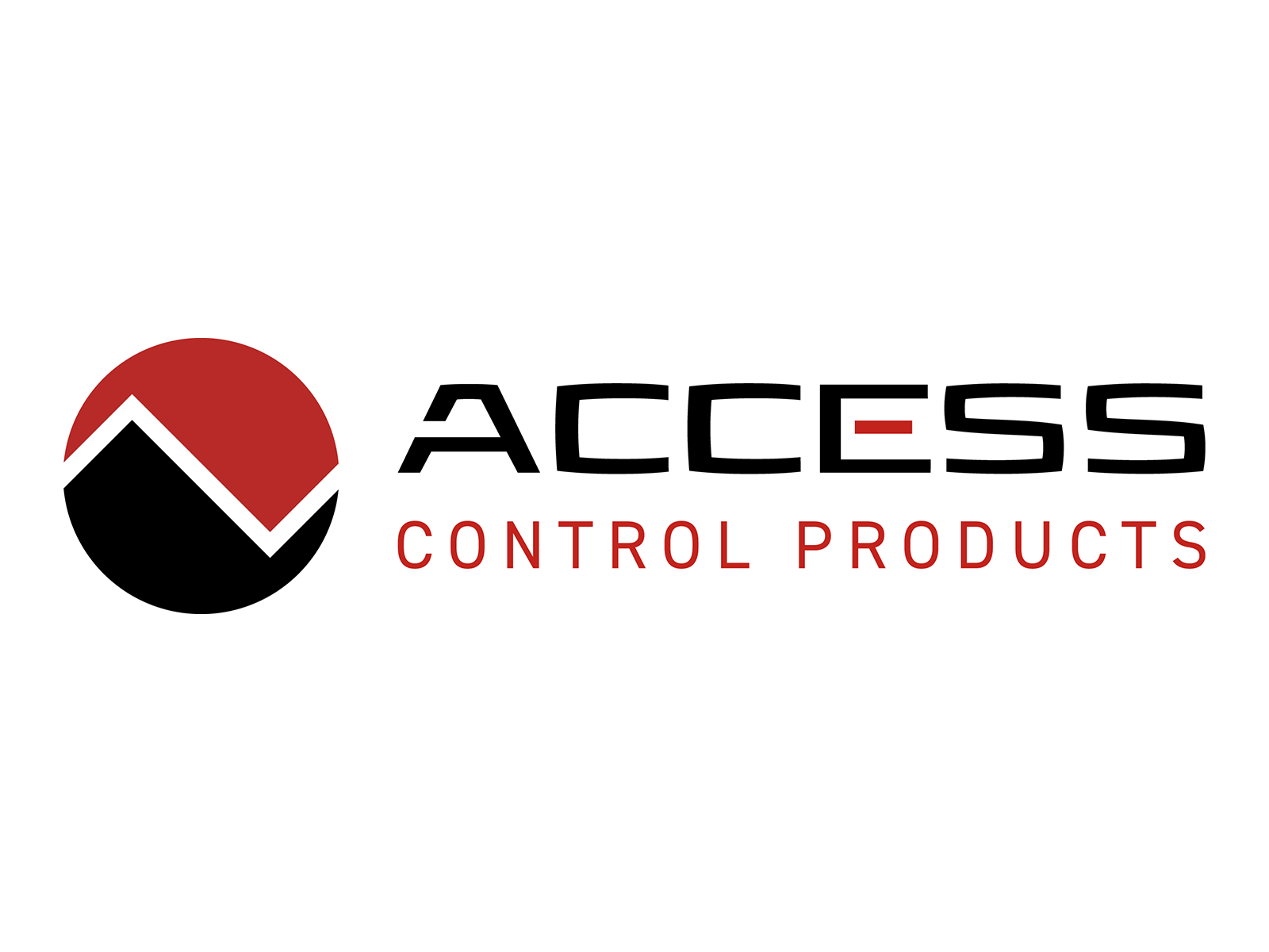
Logo
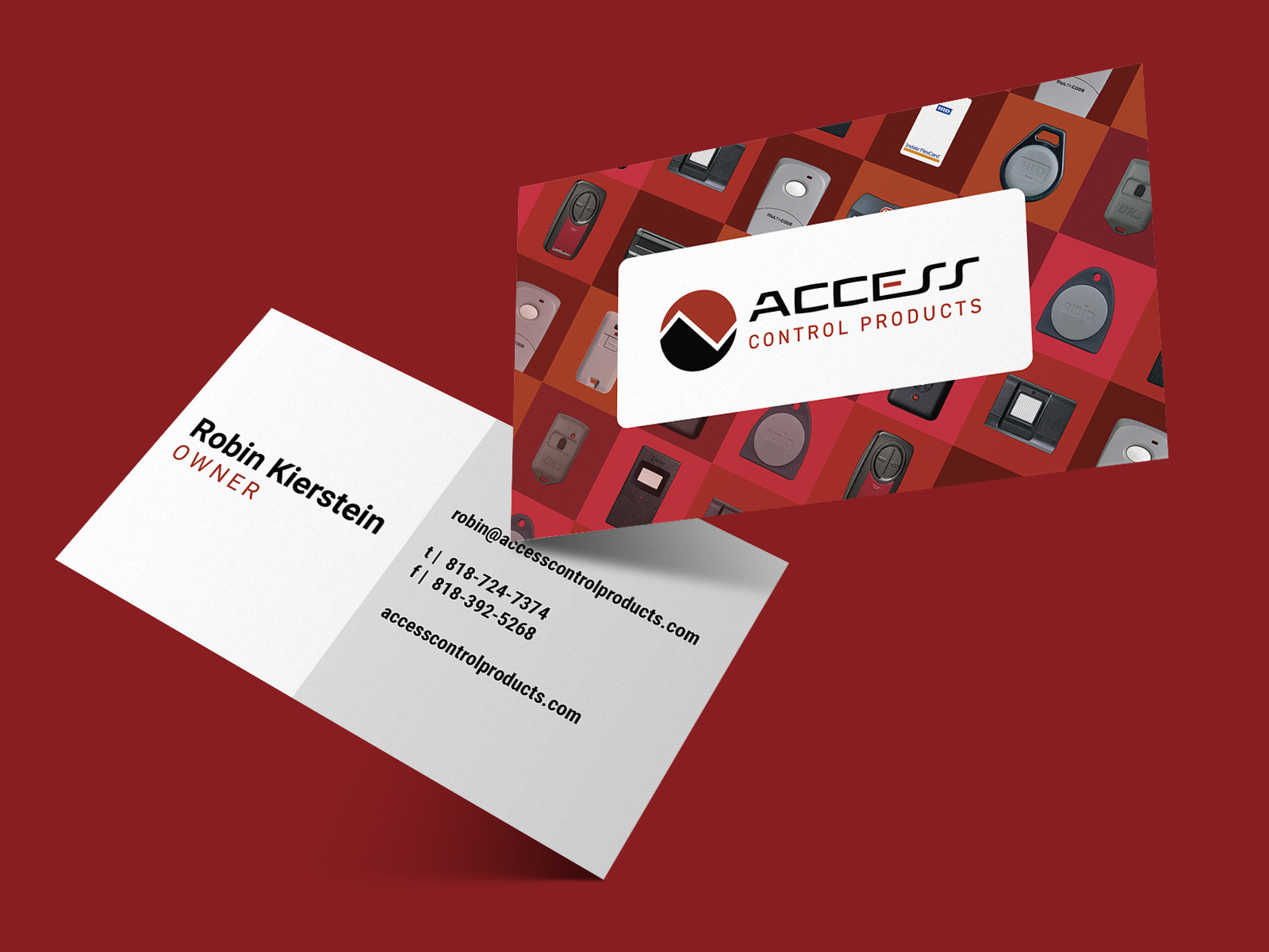
Business Card
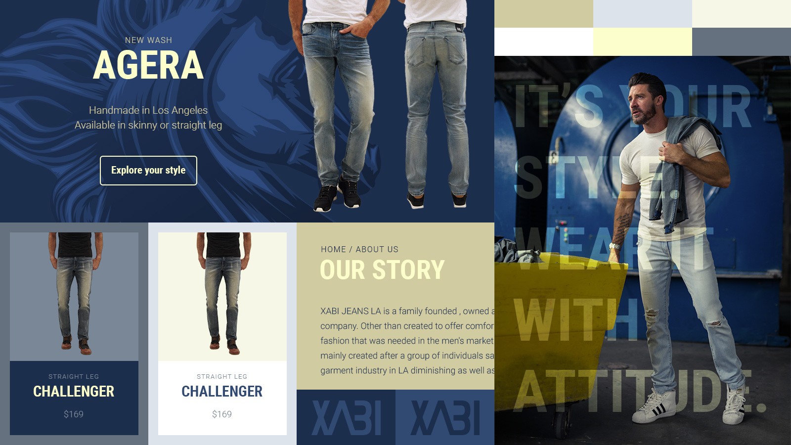
Xabi
Branding system for a designer jeans company in Los Angeles; look and feel built around logo and lifestyle photography, reflecting dynamic and youthful brand.
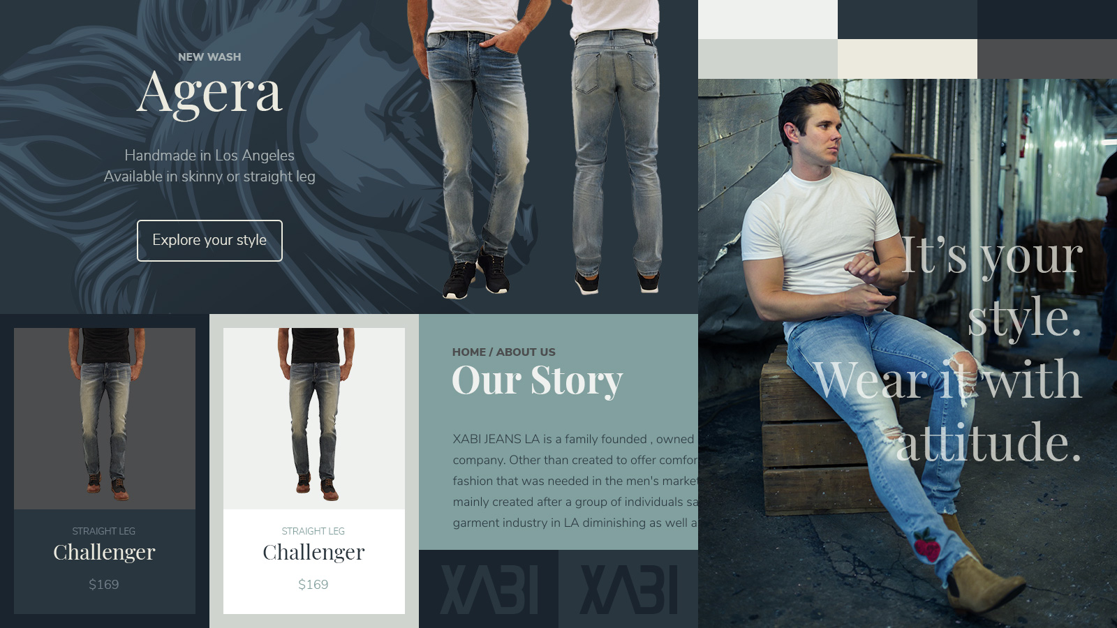
Mood Board 1